http://oddbird.net/2016/09/19/css-grid-layout/
“CSS Grid Layout is shaping up to be the layout tool we’ve always wanted on the web.”
Stacy Kvernmo (September 19, 2016)
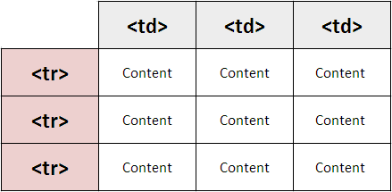
http://ictacademy.com.ng/html-tables/
In the early days of the web, developers laid things out using tables. Tables are only designed for tabular data and developers were splitting GIFs up to lay them out and create visually impressive websites but in the wrong way, creating messy code and not very accessible websites. Tables were the only way to have control over the positioning of items on the web at the time.
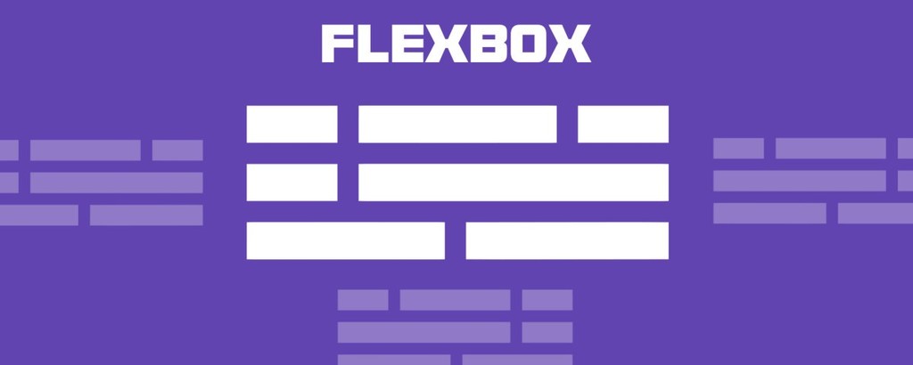
https://medium.freecodecamp.org/flexbox-in-10-minutes-7295497804ed
CSS Grid is a way to lay things out on the web. Flexbox is an alternative to CSS Grid. It’s is a way to lay out items inside of a container even when their size is unknown. Flexbox has the ability to alter its items’ width, height, and order to best fill the screen width. This helps developers to create responsive websites i.e. websites that adapt to fit on any screen size.
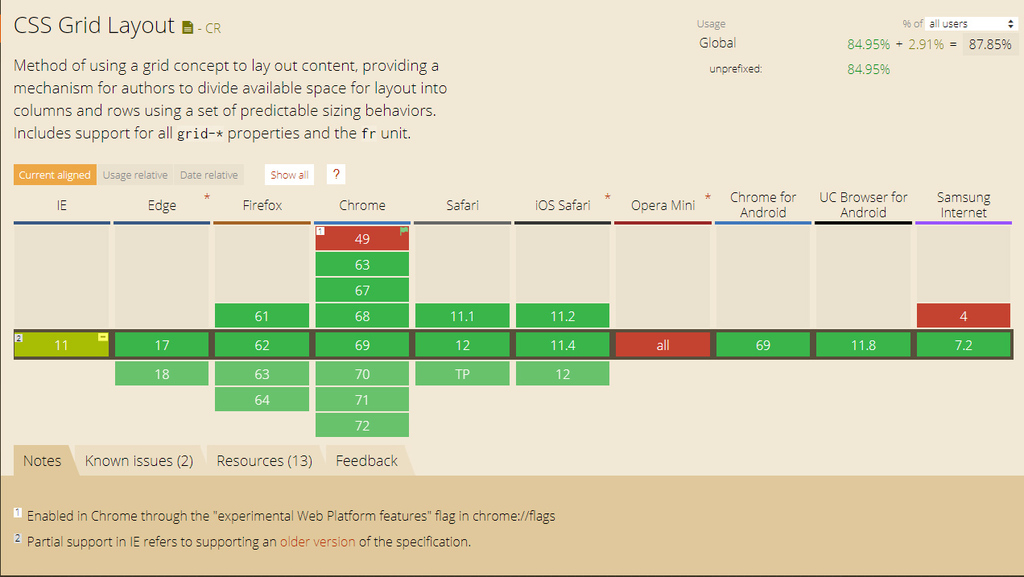
https://caniuse.com/#feat=css-grid
Support in browsers for CSS Grid took a long time, however now, almost all browsers fully support the exciting new feature.
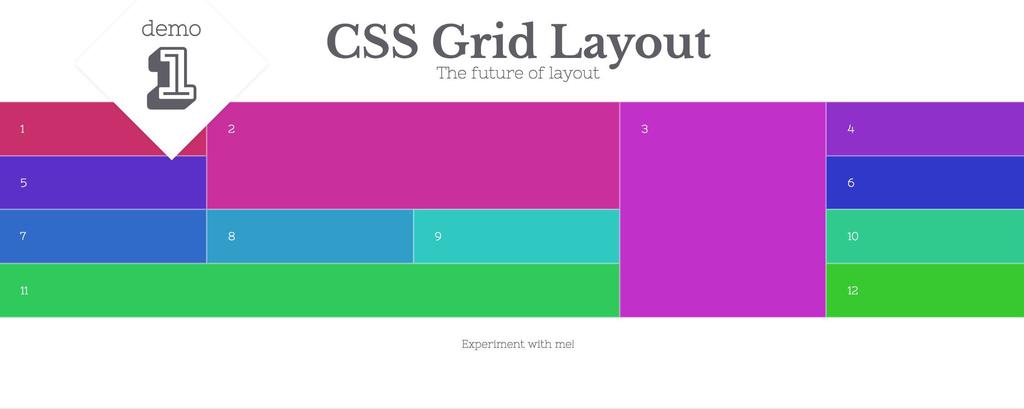
w3schools.com
“The CSS Grid Layout Module offers a grid-based layout system, with rows and columns, making it easier to design web pages without having to use floats and positioning.”
You can place divs inside of the grid and rearrange them depending on the viewport size to create responsive sites. To define a grid you set the display property to grid:
.grid-container {
    display: grid;
}
https://www.w3schools.com/css/css_grid.asp
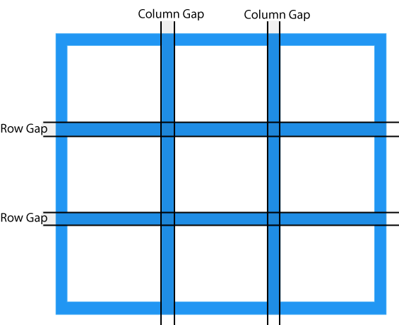
Grids are split into rows and columns. You can assign a row and column to a div which tells the browser where to display it within the grid. You can also specify a gap between columns and rows. As well as assigning a div to a row/column you can make the div span multiple rows and columns. This makes CSS Grid very flexible and easy to use, unlike other methods of displaying divs.
