P1

a)

The purpose of the above two posters is to inform the general public about the game, and ultimately to sell it. They feature the format you can play it on, the tagline which includes information on what the game is about, the name of the game and the game rating. Both posters are large and are in places where many people will see them, which will encourage people to research more about the game.

f)

The target audience for this game is 14 to 20-year-olds. The game is primarily targeted at males of this age because a post-apocalyptic world featuring robot dinosaurs appeals to them as it is something that they would have thought about as a child, and now get the opportunity to play, and live in this world. However, the game also has a secondary target audience of females of the same age. Featuring a strong female lead, this will entice girls to play the game and experience what it would be like if they were themselves out in the wild and having to fend for themselves, creating an empowering feeling. Interests of the target audience will include technology, and video games, as this is what technology could lead to on an extreme level, and it is an interesting concept for people to explore through action and adventure, as well as puzzle solving. Spending power will be quite high as the game and console cost a lot of money as well as further DLC that Guerrilla will release for the game. A high proportion of the target audience’s income will be expendable, meaning that they can buy things such as this game. The target audience’s lifestyle will be relaxed, maybe with the majority of their time at college or work, their free time will be spent gaming meaning they will already be exposed to similar titles.

g)

This game is rated PEGI 16 because it contains “Realistic looking violence towards non-human looking characters – Nonrealistic looking violence towards human characters – Violence causing minor injury only”. However, the game still targets a slightly younger audience because parents will be able to buy this game for their children as their judgement will be slightly different on the violent content, and the child may have already played similar titles featuring violence and have not displayed any change in behaviour because of this.

Amazon Locker advertisement:
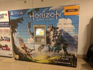
b)

The format of this is a poster, but printed onto vinyl decal and stuck onto an Amazon Locker, which is where people go to collect goods ordered from Amazon rather than having them delivered to their home.

c)

This poster has the PS4 logo in the top left corner in a large font, however, its position means that it isn’t the most important element in the photo. Horizon’s logo is featured in the biggest text in the centre of the poster which attracts the most attention. The font has been chosen to best represent the genre and theme of the game, post-apocalyptic, robot-filled world. There is a large amount of white space around this important text to draw in viewers. Zero Dawn is in a sans-serif font which shows it is very modern, and current, with The Independent claiming it is 2017’s most important game. Earth Is Ours No More is again in a font to resemble the genre and theme of the game, it is positioned in the bottom left corner of the poster, approximately the same size as the PS4 logo, suggesting they have similar importance. It has been centred meaning that No More is directly below Earth Is Ours. Below this the hashtag HorizonLockers is used, allowing users to find out more information on the product, and to tag any photos that they take. In the top right Amazon’s logo is shown in the smallest font. The orange greatly contrasts from the blues used in the Horizon advert. This is featured so that people still know that it is an Amazon Locker. Aloy, the main character of the game, is standing in the bottom left of the photo, about to fight a giant robot dinosaur. This immediately attracts viewers’ attention because it is like something they have ever seen before. The environment also looks very picturesque, which encourages people to buy and play the game. The game’s rating is displayed in the bottom left of the photo which is the smallest of all the content showing that it has to be included, but isn’t there to grasp viewer’s attention, much like the Amazon logo. There is a small margin around the whole of the poster which the text fits in, but the images span the whole front side of the Amazon locker.

Large Building Poster:
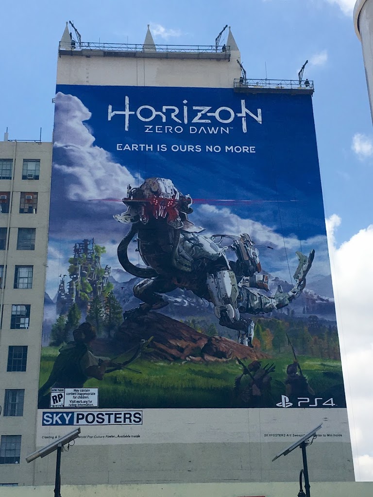

b)

The format of this is a poster which spans the side of a large building. This poster was put up in the run-up to E3, a major games conference in Los Angeles. This poster was released to draw attention to the game and to build up hype before a release date was announced.

c)

The title is in the centre top of the photograph, surrounded by lots of white space, which immediately makes it an eye-catcher. The most important element of this photo is by far the Thunderjaw, the massive robot creature in the centre of the photo. This creature is so massive and so different to anything before that it grasps people’ attention, and makes them want to find out more about the game. The Slogan uses a sans-serif font, which is very modern, which resembles the nature of the game, it is centred underneath the logo. The PS4 logo is in the bottom right of the photo, which shows what format the game will be on, which gives people more idea on whether they will want to purchase this game or at least find out more information on it. There is an age rating for not yet rated in the bottom left of the photo, with an extremely small font with the details of this, which shows that it isn’t an important part of the poster. The colours used are mainly blues and greens creating a peaceful look to the photo, showing a world that you really want to play in. The only red is in the mouth of the Thunderjaw which shows that this creature is hostile and possibly you will have to fight it in the game. An even amount of space has been used either side of the PS4 logo and the age classification, indicating a border around the image. The poster is the full width of the building, however, doesn’t go the full way down, which means it can be viewed from further away as it is a greater height.

PS4 Bundle Box Art:

a)

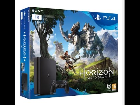
The purpose of this box art is to show off some of the most important features of the game such as Aloy, the main character, and the giant robot standing on the hills. Aloy is about to fight this creature with her bow and arrow, which is what the game is about, so the image indicates this clearly. People who are at the stage of buying the PS4 and game will probably already know lots about the console and game, which is why there isn’t too much information on the front of the box. The age rating and developer’s logo are in the bottom right of the game box, out of the way and small, showing that they aren’t important. The Horizon Zero Dawn logo is the biggest object on the box, apart from the monster, which attracts a lot of attention. Notably, it is more important than the name of the console itself, the PS4, which is situated fairly largely in a blue shape in the upper right hand of the box. The manufacturer’s logo, Sony is displayed in the top left underneath which is the size of the PS4, in a striking white box, which makes it stand out. This has been done to avoid confusion between the two different sizes, and subsequently different prices. An image of the system has been included in the bottom left, overlaying the Horizon Zero Dawn artwork. The PS4 image is fairly large making sure you know the sleek lines of the console that you are buying. There is a disclaimer next to the 1TB text box which is in grey colour on top of a dark background and it is very small making it hard to read. This is because it is not very important to the average person, but has to be included for legal reasons. There is a margin around all four sides of the box for text, which is even and clear, making the text stand out more, as it doesn’t look like it is falling off the box. The images, however, span the entire face of the box.

P5 – Final Idea

a) purpose

For photography students to share ideas, and work in a safe, secure environment. They can follow their favourite photographers. Write blogs and use this as work experience on their CVs. They can find people to work with to practice their skills and to learn from.

b) content

There will be a navigation bar at the top of the page. Popular photographers will be featured on the home page, encouraging people to like and follow them. Users will have a profile page with a showcase of 25 photos, and all of their work, including recent blog posts. There will be an explore page where users can search for photographers or content. Adverts will be displayed among search results and featured photographers. The adverts will be non-obtrusive.

c) target user/membership

Target users are photography students aged between 16 and 25. They will be interested in the world around them, and in doing photography later in life. There will be a paid option which removes adverts and offers users advanced statistics about their blog and profile as well as a portfolio website. Members will pay £5 per month to get these features.

d) production plan / timescales

f) possible revenue streams (how it might make money)

The website will feature non-obtrusive advertising throughout which will bring in the majority of revenue for the company. There will be a paid membership option which will also bring in revenue for the company.
6 Months after the initial launch of the website we hope to have 5000 people signed up. Approximately 5% of these will pay to be members. 250 Members * £5 per month = £1250 per month. This is already a profit of £990.01 per month. Adverts running on the site will give us a revenue of approximately £100 per month depending on website traffic. Overall profit will be £1090.01 per month.

g) budget

All the design work has been done for free, by me. The website will then need to be coded into a working example. Presuming one web-developer will work on this website for 30 hours per week for 1 week to create the website and get it to a state to be published if he works for £25 per hour this initial process will cost £750.

The website will then have an additional cost per month for server hire, website domain name, professional email, and website maintenance provided by our full-stack web-developer. Server and Email and Domain package will cost £9.99 per month. Our developer will need to work on the website for 10 hours each month to implement security fixes and updates, this will cost £250. Therefore, the website will cost £259.99 per month to maintain.

h) consider legal/ethical issues

Photography is often used to express the human body as an art-form which leads to nude photography, as this website is for students, potentially underage, no photography of this kind will be allowed on the site. Users under 13 will require their parents’ permission to sign up to the site, but there will be no age limit to join.

i) Privacy/security measures

The website will use HTTPS to encrypt the connection between the server and the user’s computer. The database containing members passwords will use 256-bit encryption. The website will use a CDN to serve images, making the website load faster. There will be a custom right click plugin installed on the website to prevent people from saving users images. Only low-resolution images will be shown on Google, preventing people from stealing our members’ images. Copyright logos will also be shown on the images.

j) site map

k) Detailed information as to why that target audience will find it useful and easy to navigate around the website.

The target audience will find this website useful as it will help them develop their photographic skills. Only the most important pages have links at the top of the page, whilst the more in-depth terms and conditions pages are at the bottom of the page out of the way in order to showcase users’ photos at the top of the page.

The homepage has many links to sign up to the website, encouraging users to do just that so that they can see all the features. Text hierarchy draws users to read the catch phrase, then to join the website. If people continue scrolling down they see high standard images from users on the site, giving them an example of what the site is used for. The footer contains links to more in-depth pages containing information for the press, about the company, copyright information, jobs, etc. These page links are in a list with a header summarizing what the links below are about. This helps users to navigate to the page that they want and find out the correct information.

A user’s page is very simple, with the nav bar at the top of the page, allowing users to search the site, upload photos, and navigate through the site. There is a cover image chosen by the photographer which will be their best photo, then there is their logo which is a circle, situated in the centre of the page. There is a brief biography below the user’s name, with links to different sections within their account. Images are presented clearly, cleanly and take up most of the page, as this is what the website is for, and this is what the target audience will want to see. The same footer is used for ease of use so that the website has a coherent corresponding design.

The website is very simple to use and features a design that does not change on different pages, this makes it easy to use for the target audience as they want to get information as quickly as possible so don’t want to click through lots of different web pages in order to look at a feed of photos. Photos are very large on the website as this is a photography website which means it will attract the target audience and they will be able to see examples of work that they could do or photographers they could work with.

P4 – Final Documentation

Production Schedule:

Date
Activities
Details
Personnel
Contingency
09/10/17 to 17/10/17
Character Design
Design a character sheet in Illustrator including emotions and activities
Joe Bailey
If Illustrator doesn’t work then I will draw my character designs
09/10/17 to 02/11/17
Treatment
Write about target audience, legal and ethical issues, synopsis, medium
Joe Bailey
 
09/10/17 to 02/11/17
Production Schedule
Create a timetable for the animation production
Joe Bailey
 
15/10/17 to 29/10/17
Script
Write a script for the animation including notes for different scenes
Joe Bailey
If a script can’t be completed, then we will use the lyrics from the song
15/10/17 to 02/11/17
Storyboard
Draw 24 frames of a storyboard for a scene within the animation
Joe Bailey
 
02/11/17 to 09/11/17
Paper Cut Outs
Create our characters in paper form and animate around 30 seconds of footage
All
I have chosen to do the stop motion animation first as they take the longest time, therefore we can take as long as we need to do this complex form of animation, and if some of the computer generated animation can’t be finished within the confines of the school timetable, we shall take home some work and complete the animation over the christmas break.
09/11/17 to 16/11/17
Claymation
Animate scenes from the song, using our script, in clay. A penny falling down a manhole cover, dollar flying on the wind
All
 
16/11/17 to 23/11/17
Animate
Draw and animate 30 seconds of footage using our script. Record and Cassette kissing. Daisies fluttering in the wind. Drawing of a vase
All
 
23/11/17 to 30/11/17
Photoshop
Animate 30 seconds of footage using photoshop and our script. Flexing muscles, a piano being played a teddy bear singing
All
 
30/11/17 to 06/11/17
Premiere
Army man walking into boat. Match burning. A hospital and school building
All
 
01/12/17 to 07/12/17
Maya
Record spinning on a turntable being scratched by a hand with yeahs looking like comic strip sounds
All
 
07/12/17 to 10/12/17
Composit in After Effects
Combine all our footage in After Effects and do some final touches
Joe Bailey
If our different forms of animation do not blend seamlessly with eachother then we shall use after effects to create sequences inbetween the scenes to make the video flow, we shall therefore cut out sections of our footage to allow for these after effects compositions
10/12/17 to 15/12/17
Output Premiere
Output into Premiere to perform further final touches and to make sure all the clips go together
Joe Bailey
 
15/12/17 to 04/01/18
Rough Cut
Create a rough cut and get feedback on it
Joe Bailey
If feedback is generally negative and we don’t have enough time to make all the changes possible we will try our best to change the footage, making sure we render different versions of the video in order to still have one to upload to Youtube
04/01/18 to 11/01/2018
Final Edit
Act upon feedback and make the video perfect, ready for viewers
Joe Bailey
 

Story Boards

Treatment:

Title and Running Time:

Jenifa Taught Me by De La Soul lasts 3 minutes and 24 seconds. We will use the same title as the song to avoid confusion, and also because we will not have massively changed the story or the song. Our animation is going to be 3 minutes long so we shall cut out most of the end of the song.

Voice Over Artists:

If we were making a professional animation with a high budget we would want to have a short intro with our animator’s names read by Liam Neeson who will undergo voice tests and casting. He is a well-established actor, who has been in over 100 different TV Shows and Movies. His appearance in our video will immediately attract viewers. His reading of the title sequence is supposed to be a comical element as his tone of voice is completely different to the song. Also, people who have never heard of Liam Neeson, but like De La Soul, will be likely to research him and watch some of his films after viewing our animation music video. However, our animation is not going to be professional, so we will use one of our classmates to read out our intro, however, we may not include this in the final edit of our video.

Medium:

We will have our main characters dancing about the title screen in order to introduce them, and make them seem funny. We are going to split our animation into 6 sections in order to incorporate a variety of animation types. The song has 4 verses, so we are going to split verse 2, and use the title sequence for one of our animation types. This sequence goes as follows: Title – Paper Cut-Outs Verse 1 – Claymation Verse 2.1 – Animate  Verse 2.2 – Photoshop Verse 3 – Premiere Verse 4 – Maya Each sequence will last approximately 30 seconds with a transition sequence between them such as zooming in on a block of red clay, and zooming out on a block of red colour in Adobe Animate.    We are going to publish our video on Youtube with a target frame rate of 30 frames per second and a resolution of 1920×1080 pixels. We will composite the multiple 30-second sections of our video in Adobe After Effects.

Synopsis:

Our animation will feature 3 main characters, representing the characters talked about in the lyrics. There will be a music note which represents Derwin. He will be a small, funny character, who seems a bit geeky and doesn’t have many street smarts. His emotions will change rapidly, with big eyes, and a big smile. There will be a record which represents the narrator of the song, Dave. The record is very full of himself, and confident, without a care in the world. He is often seen talking to Jenifa, and showing off. During the song ohhhh is said a lot, generally represented by the letter ‘o’ this is convenient as a record is the same shape as the letter ‘o’, a circle, therefore the camera can zoom in endlessly on the record to symbolise the sound of ohhhh. There will be a record player representing Jenifa which enables the record to be put on the record player when the song talks about sex, such as the lyrics “So to the kitchen she did Dan”. The record player will be very pretty and nicely kept, enticing the record on to it. 

Key Scenes:

Our animation is going to follow along with the lyrics of the song. In the first verse Dan and meet Jenifa for the first time whilst he is in school. He is love-struck and drops his textbook. The next day he wolfs down his breakfast and can’t wait to see Jenifa at school. They pass notes in English class. Jeny loses a penny, so Dan gives her a dollar as an act of kindness, and also a way to get in her pants. She kisses him and he is excited. The school bell rings and Jenifa grabs Dan’s hand and takes him home. Verse two talks about Jenifa and Dan after school. They go to a shop and he buys some records and she cassettes. She’s doing more than just flirting and grabs his jeans, this surprises him, but he likes it. She has a body shaped like a vase, which means she is very attractive. He takes her clothes off and remembers he is only a virgin. She says “Let’s try it in the bathroom” but he says he doesn’t like sinks, so they do it in the kitchen. The other band members are happy that Derwin has got laid. The sex was good as Jenifa passed her test. They cuddled a teddy afterwards. Dan was in Heaven he felt so good. Jeny was a big tease at the school, so she was known as a hoe. Verse 4 is a summary of what he has learnt, which is not to be with a girl that flaunts all she has got. 

Current Trends:

Currently, music is used a lot with animation to help viewers determine feelings and emotions. Our animation will stick with this trend as it will be a music video and the animation will be relevant to the lyrics. Most animation sequences in 2017 fit into one of two categories, either extremely lifelike or completely abstract. Due to the nature of the song being very abstract, our animation is going to be part of the latter category and feature many bright colours and abstract shapes. Many animated movies use 3D computer animation using high-resolution assets to create a lifelike, yet still completely different story. Movies that have done this recently include Cars 3, Despicable Me 3, and Captain Underpants. We are going to be keeping with this trend by having a section of our animation using 3D computer-generated images.

Target Audience:

The target audience for our animation is 16-25-year-olds. The song we have chosen has an adult theme, which means only an older audience can listen to it. Our animation will not, however, portray this same theme, instead, taking the lyrics literally, such as in the song he says garden tool, implying that Jenifa is a hoe, we will simply animate a garden tool. The style of music appeals to this target audience, so we will be animating the video for them as well, as it would be silly to animate a song targeted at 16-25-year-olds in a way that appeals to 80-100-year-olds. We will be using a style of very abstract ideas with bright colours which will entice and intrigue our target audience as they will have to pay attention to work out what is going on. We will also use a comedy element in our story which will make viewers laugh and want to share the video with their friends, making it go viral. 

Legal and Ethical Issues:

There are many legal and ethical issues to take into account when creating a production of any kind. The song we have chosen has a deep sexual theme rooted to it, however, we won’t be animating this, instead taking lyrics literally in order to get our animation seen by a wider audience. We will only be using one song in our production, and we will have to get the rights from Tommy Boy and Warner Bros in order to publish our completed production using the song Jenifa Taught Me. We will be publishing our music video online. The regulatory body for music videos published online in the UK is the BBFC. Record Labels are required to submit videos for review that are expected to get a rating of 12 or above. Things that the BBFC look for include:  Drug misuse Dangerous behaviour presented as safe Bad language Sexual behaviour and nudity Threatening behaviour and violence We will deliberately animate our video avoiding these themes, but still trying to engage with our target audience. We will submit our video for review, but we aim to have no classification.  Our characters will display no logos of any kind, so we will not be promoting any record or record player companies. We will gain permission from Liam Neeson to use his voice in the intro of our production.  

Website Designs

a)  purpose

A family-based social networking platform similar to Facebook but without memes and pages. Members will be able to post status updates, along with photos and videos to share with their family and friends. There won’t be alike or share system, but people will be able to comment on posts, with a very in-depth sensor system, allowing users much younger than 13 to join the site, unlike Facebook. Images will be stored at high quality as a way of backing up photos, there will be an option to download everything ever uploaded to the site if users lose their photos.

b)  format/style

There will be card based posts on a user’s feed that people can swipe to get rid of, much like Inbox by Google. They will swipe them after they have seen them to remove them from the newsfeed. Users will have profile pages displaying all of their posts, and a little section about them to help other users identify who they are.

c)  target user/membership

Target users are 20-40-year-old parents of both genders who want to share their photos with extended family members and friends. It will be free to join the site, with options to pay for upgraded storage to store more photos.

d)  mock ups
a)  purpose

A website for designers to post their ideas and designs and get feedback from other likeminded people. There will also be employers on the website which can find designers suited to their workplace which they can get in contact with to hire.

b)  format/style

The website will be very nicely designed using a minimal style as it is aimed at designers so will have to look nice. There will be no adverts on the site. The homepage will be an about section, explaining how the site works. There will then be a page featuring the latest designs from people all over the world. There won’t be a search function, but people will be able to sort the feed into categories such as posters and websites.

c)  target user/membership

Target users are designers aged 20-30 with a high spending power as you have to subscribe to this website $4.99 a month. This ensures only the best designers are putting their best work on the site. The website will be global, with a headquarters in America.

d)  mock ups
a)  purpose

For photography students to share ideas, and work in a safe, secure environment. They can follow their favourite photographers. Write blogs and use this as work experience on their CVs. They can find people to work with to practice their skills and to learn from.

b)  format/style

There will be a navigation bar at the top of the page. Popular photographers will be featured on the home page, encouraging people to like and follow them. Users will have a profile page with a showcase of 25 photos, and all of their work, including recent blog posts. There will be an explore page where users can search for photographers or content. Adverts will be displayed among search results and featured photographers. The adverts will be non-obtrusive.

c)  target user/membership

Target users are photography students aged between 16 and 25. They will be interested in the world around them, and in doing photography later in life. There will be a paid option which removes adverts and offers users advanced statistics about their blog and profile as well as a portfolio website.

d)  mock ups

P3 – Character Design

Character Profile:

Person/animal/object? 

My character is an object – a music note. This fits with the style of production.

Name?

Musically as he is a music note.

Age?

21 which is a similar age to the singers.

Clothing?

Doesn’t wear clothes – is an object. However he is not naked as this would make the age rating of the video increase.

Nationality/region?

American – Haitian decent. Same as the main singer of De La Soul, Trugoy The Dove

Interests?

Art and making music. Again fitting with the theme of the production.

Likes/dislikes?

He likes girls, which is what the song is about.

He dislikes school, as every teenager does.

Character Development:

Final Character Design: