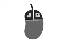
My first project at university was to write a report on how I designed a set of logos to brand myself as a web developer. We had to include research, feedback and final designs. I got a C1 on this report as I found it quite hard being the first one I’ve done at university. You can see the logo below:


I attended a workshop in Hotel Mercure Southampton Centre Dolphin on rankingCoach by Alasdair Stone. It was a very interesting event and we learnt about how to optimize
“Make beautiful products, faster.
Material.ioMaterial is a design system – backed by open-source code – that helps teams build digital experiences”
https://9to5google.com/2018/04/26/what-is-material-design-2-examples-launch-io/
Material is a design language created by Google in 2014 for the Android platform. It has unified Android apps under a single design format. This has helped to give the Android platform a unique identity recognizable everywhere, however,
“Material Design is a visual language that synthesizes the classic principles of good design with the innovation of technology and science.”
Material.io
Many say that material design is the future, aiming to unify
https://thenextweb.com/dd/2015/11/10/what-are-the-real-merits-of-material-design/
Material design isn’t just about the way Google and Android do things. It’s changing design philosophy as a whole. One popular feature of
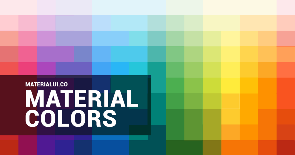
https://www.materialui.co/colors
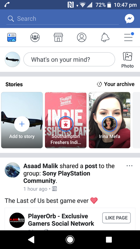
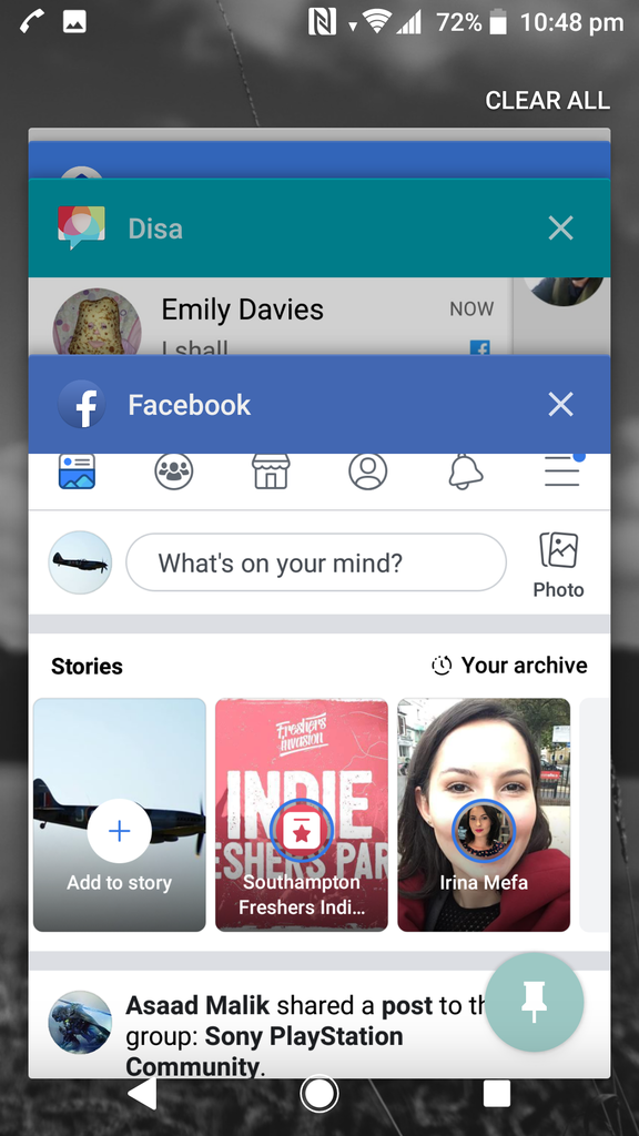
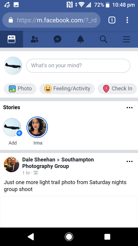
Material design is very specific about the way designers use colours. The design specifies for calmer colours. Often shades of the same colour are used together along with the card system to symbolize depth. The way designers use colours can have a large impact on the identity of a brand, as one colour will be associated with that brand. The Android platform lets designers insert their brand colour into many different places such as Google Chrome’s tabs, app headers, and on the app task view. For example, Facebook uses this on the Android platform to display their signature blue colour everywhere they can. This helps create the brand’s identity, as whenever anyone sees that colour, they will recognize Facebook.
I went to a Barcamp in Southampton, which consists of people giving talks on things they find interesting, with a heavy bias on technology. The normal talks last 45 minutes to an hour. They also have an opportunity to give lightning talks after lunch which last about 10 minutes and can be about anything. I gave a talk on flash fiction, but as I was the last one and it was just after lunch the audience had lost their attention.
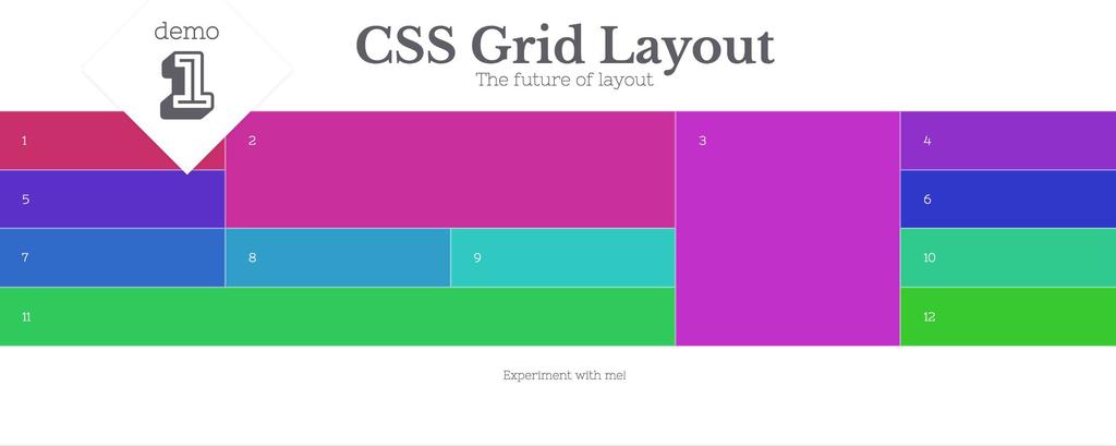
http://oddbird.net/2016/09/19/css-grid-layout/
“CSS Grid Layout is shaping up to be the layout tool we’ve always wanted on the web.”
Stacy Kvernmo (September 19, 2016)
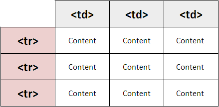
http://ictacademy.com.ng/html-tables/
In the early days of the web, developers laid things out using tables. Tables are only designed for tabular data and developers were splitting GIFs up to lay them out and create visually impressive websites but in the wrong way, creating messy code and not very accessible websites. Tables were the only way to have control over the positioning of items on the web at the time.
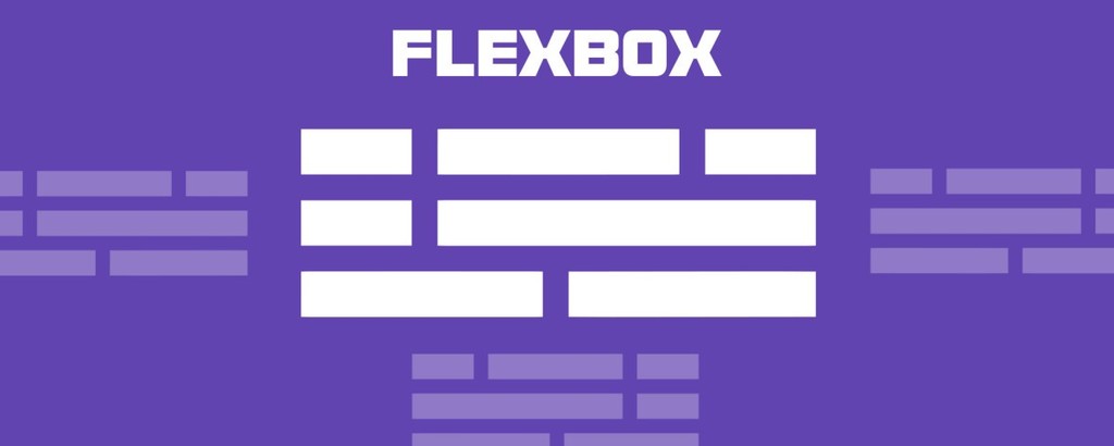
https://medium.freecodecamp.org/flexbox-in-10-minutes-7295497804ed
CSS Grid is a way to lay things out on the web. Flexbox is an alternative to CSS Grid. It’s is a way to lay out items inside of a container even when their size is unknown. Flexbox has the ability to alter its items’ width, height, and order to best fill the screen width. This helps developers to create responsive websites i.e. websites that adapt to fit on any screen size.
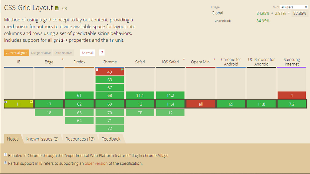
https://caniuse.com/#feat=css-grid
Support in browsers for CSS Grid took a long time, however now, almost all browsers fully support the exciting new feature.
w3schools.com
“The CSS Grid Layout Module offers a grid-based layout system, with rows and columns, making it easier to design web pages without having to use floats and positioning.”
You can place divs inside of the grid and rearrange them depending on the viewport size to create responsive sites. To define a grid you set the display property to grid:
.grid-container {
    display: grid;
}
https://www.w3schools.com/css/css_grid.asp
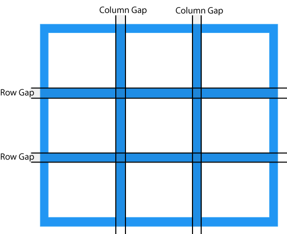
Grids are split into rows and columns. You can assign a row and column to a div which tells the browser where to display it within the grid. You can also specify a gap between columns and rows. As well as assigning a div to a row/column you can make the div span multiple rows and columns. This makes CSS Grid very flexible and easy to use, unlike other methods of displaying divs.
I’ve just started my first proper job in the Web Design and Development industry at Fluid Studios Ltd and it’s going really well. I’m also starting to get ready for university, the next big exciting chapter in my life.
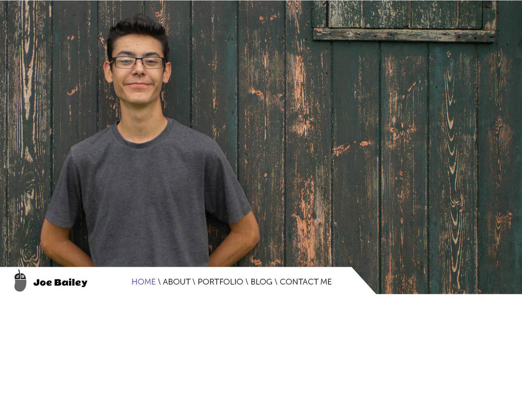
I’ve started creating a site to showcase my work as a web design professional. Once finished it will be live at joebailey.xyz I’m not really feeling it as much as my photography website, I don’t think the design flows that well, and it doesn’t really optimize for mobile all that well either. I think maybe in 6 months or so, once I’ve learnt more, I’ll design it again with a mobile-first approach. For now, I’m just concentrating on getting it finished and published as yet another example of my work.
