In order to use many of the new Web Technologies you first need a platform to test them on. This is my photography website. I am very passionate about photography and like to keep my website as close to the cutting edge as possible.
To mark the beginning of my second year at University I thought that I would try learning a new skill, namely Vue.js. I usually struggle to learn something if I don’t see any real practical application for it, but this time I figured I could turn my photography portfolio into a dynamic Vue.js enhanced page.
I started with creating a component for the portfolio elements on the homepage. I created a data set that contained all the information for the component. Vue then iterated over each one and created them. I then did the same for the images, once you’d clicked through to a specific component.
Next, I had to implement Vue Router, in order to get dynamic URLs. This was very tricky and took me a while to figure out that I needed to place the Portfolio page within a subfolder to apply .htaccess rules to it. Everything works now and it’s even a better way of showing all the images at once compared to the old method of just having the images pop up in a Lightbox. This would have never been possible without Vue as it would have taken too much time to hard code each image (there are 100s).
The next steps are to do a bit more styling and arrange the photos so that portraits and landscapes aren’t all next to each other breaking the flow of the page. I’m also going to take this as an opportunity to go through my portfolio and slim them down to around 25 of my best photos. The code is quite messy too so I might put each component in its own Vue file. In the far future, I’m thinking about possibly using Vue Native to turn the portfolio into an app.
Overall, it’s been a great experience learning Vue and it’s one step closer to a full-time developer role after I graduate.
Over the past couple of months, I’ve added some Analytics software to my site such as Google Analytics and Facebook Pixel. As my website serves customers in the EU, the Cookie Law applies. I have used JavaScript to ensure that cookies are not fired until the user has explicitly accepted them on the website. A button and banner are shown at the bottom of the screen for new users.
I read the following article by CSS Tricks https://css-tricks.com/prevent-page-scrolling-when-a-modal-is-open/ and decided that my website shouldn’t scroll whilst the lightbox is shown, i.e. on the Blog and the Memories pages when an image is clicked.
I use the Featherlight plugin on my Blog and the equivalent for the Memories page.
I added the following CSS to my Blog, which now means that the page will not scroll whilst the lightbox is open, but sticky elements like the navbar and the sidebar will stay in place. Similar code was added across the rest of the site.
html {
	position: relative!important;
	overflow-x: hidden;
}
html.with-featherlight {
	overflow-y: hidden;
	width: 100%;
}
html.with-featherlight body {
	overflow-y: scroll;
}
html.with-featherlight nav.featherlight-fix {
	position: fixed;
	margin-top: 0;
	left: 0;
}
html.with-featherlight #sidebar.featherlight-fix ul:first-child {
	position: fixed;
}
html.with-featherlight .cc-window.cc-banner.cc-type-info.cc-theme-edgeless.cc-bottom.cc-color-override--591744288 {
	width: calc(100% - 17px);
}
@media (max-width: 830px) {
	html.with-featherlight nav {
		margin-top: 0px;
	}
	.featherlight-previous, .featherlight-next {
		display: none!important;
	}
	html.with-featherlight #sidebar ul:first-child {
		position: -webkit-sticky;
		position: sticky;
	}
	html.with-featherlight .wrap {
		margin-top: 50px;
	}
}
@media (max-width: 830px) {
	html.with-featherlight nav {
		margin-top: 0px;
	}
}
@media (max-width: 1100px) and (min-width: 830px) {
	html.with-featherlight header.featherlight-fix {
		margin-bottom: 68px;
	}
	html.with-featherlight nav {
		margin-top: 0;
		margin-bottom: -7px;
	}
}
Whilst experimenting with this I found that the built-in WordPress galleries did not work on Safari 10.1. I then filed a bug report which you can follow here: https://core.trac.wordpress.org/ticket/47744
I read the following article: https://www.howtogeek.com/434592/what%E2%80%99s-new-in-chrome-76-arriving-july-30th/ and was excited by “Automatic Dark Mode is Coming to Websites”. I decided to give it a shot. I read up on the Media Queries Level 5 spec and added the “prefers-color-scheme” media query to my CSS.
I downloaded a copy of Chrome Canary to test the website, as this feature isn’t quite out in the current release of Chrome yet, however, the media query is supported in Firefox, so if you have Firefox installed and dark mode turned on, go check my website out.
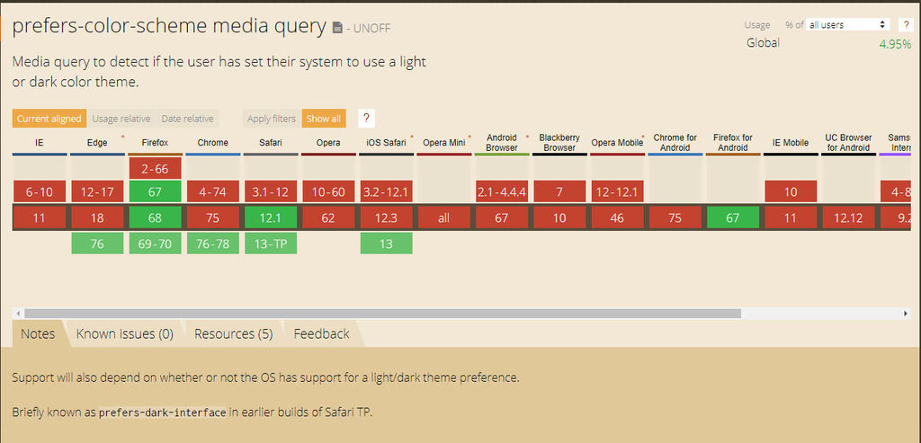
Here’s a sample of the code I used:
@media screen and (prefers-color-scheme: dark) {
	body {
		background-color: #202124;
		color: white;
	}
}
By using Chrome Canary I also found out that I could install my website to windows, and not just my phone, which I found really cool. It comes up in start, the taskbar, the desktop, and has its own icon. I was astonished. The internet is really moving in a cool direction and I’m glad to be pioneering these new technologies with my photography website.
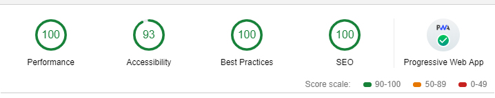
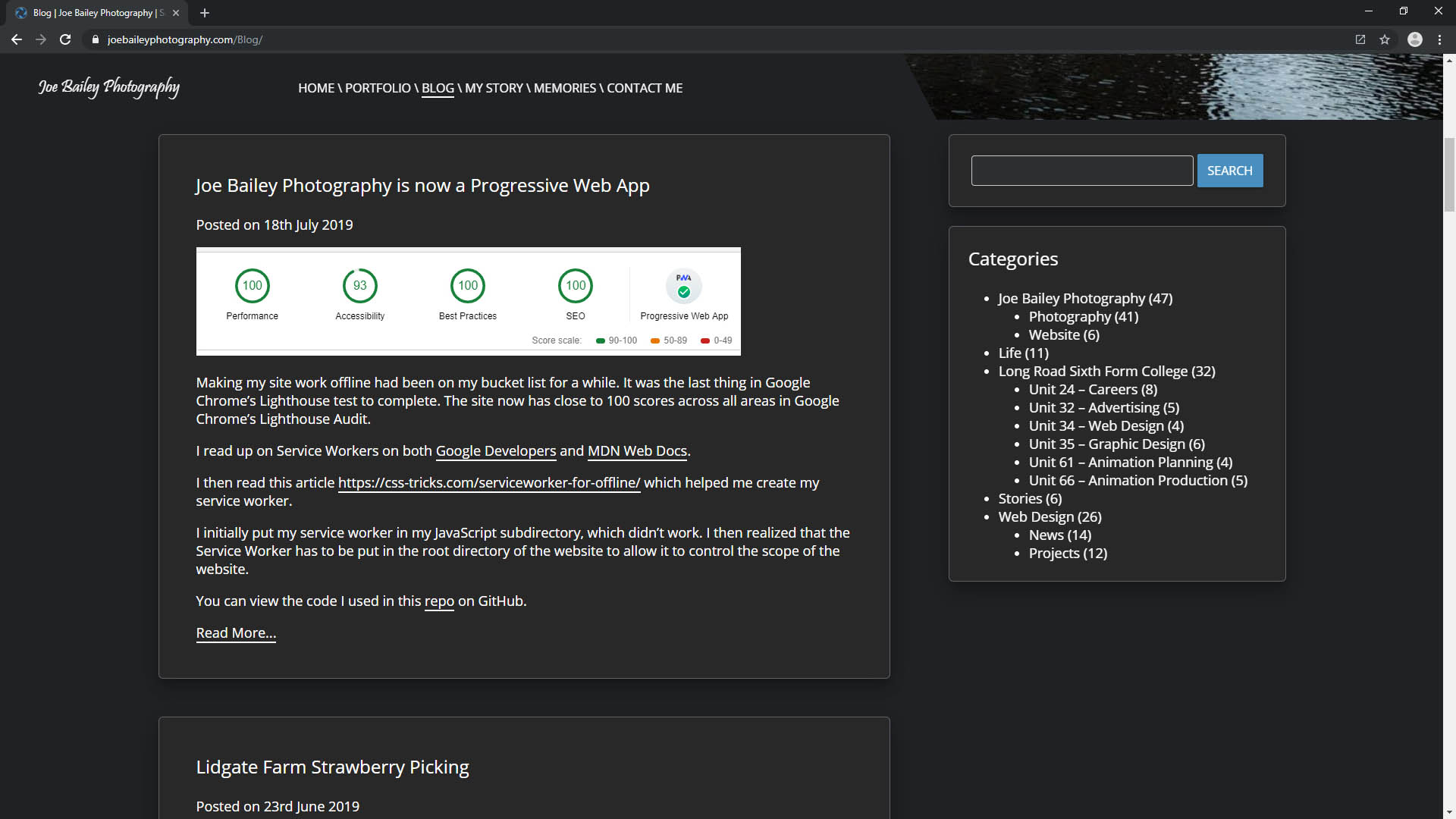
Making my site work offline had been on my bucket list for a while. It was the last thing in Google Chrome’s Lighthouse test to complete. The site now has close to 100 scores across all areas in Google Chrome’s Lighthouse Audit.
I read up on Service Workers on both Google Developers and MDN Web Docs.
I then read this article https://css-tricks.com/serviceworker-for-offline/ which helped me create my service worker.
I initially put my service worker in my JavaScript subdirectory, which didn’t work. I then realized that the Service Worker has to be put in the root directory of the website to allow it to control the scope of the website.
You can view the code I used in this repo on GitHub.
After creating my Web Design portfolio site and transferring my hosting package I was in the mood to do some web design. I’d been meaning to add a portfolio to my photography site for a long while.
Whilst making the photography portfolio I created some cool code to create a gallery of images which you can read about here.
I used a card style to design the portfolio and includes galleries of the best of my photos grouped into categories. It also includes, events, projects, and portraits, something that has never been seen on my site before.
I then implemented the card style for the blog posts on my homepage.
After creating the great bit of code I used it to alter the galleries on my memories page, which makes it load a bit quicker, and includes WEBP support. As I was feeling quite clever, I added a search function and the option to filter the memories by year.
