PlayStation 4 Racing Game
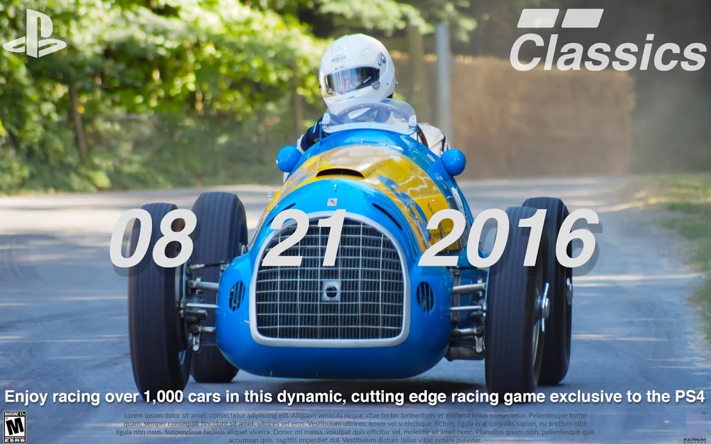
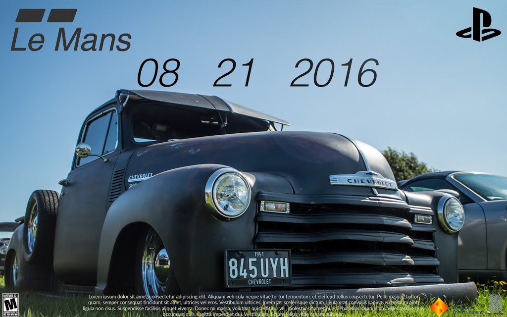
Poster:
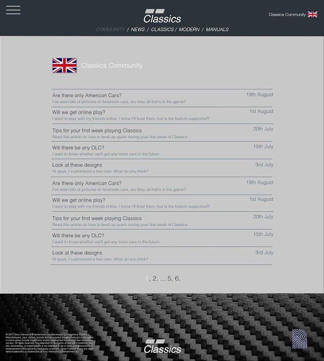
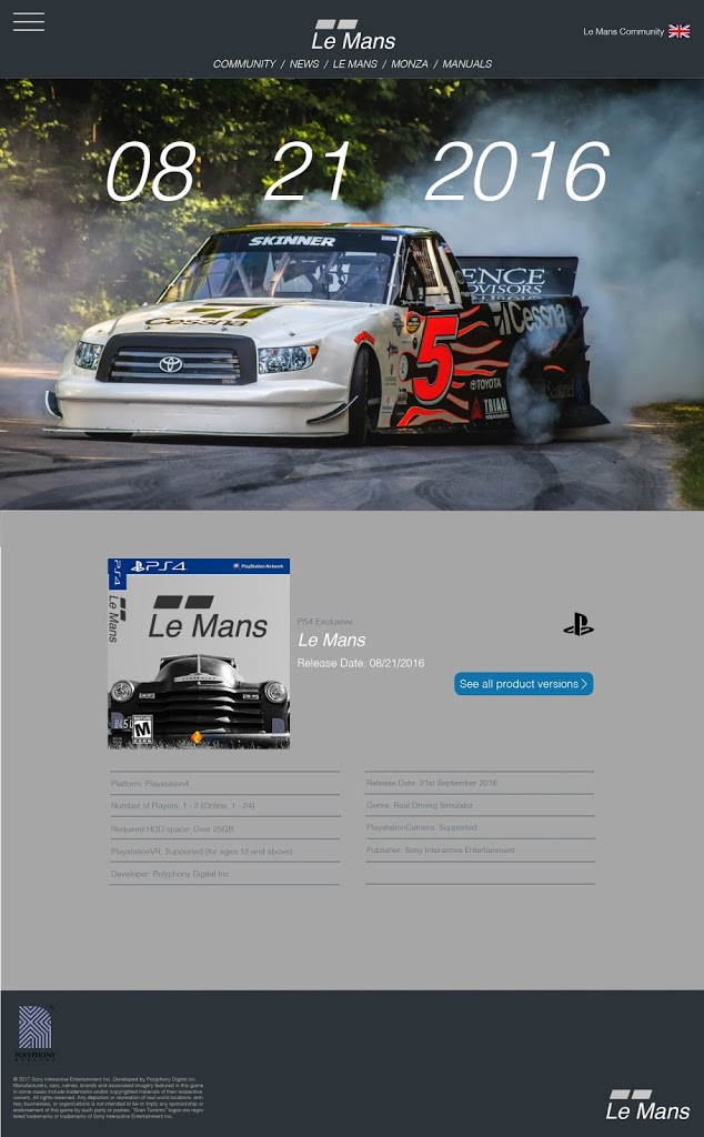
Website:

Website Forum:
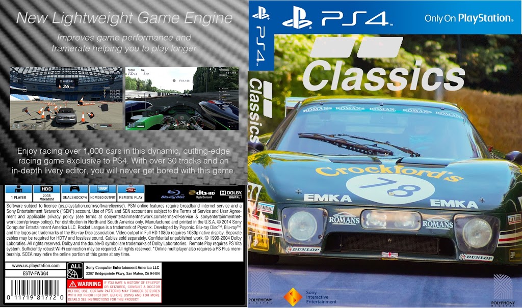
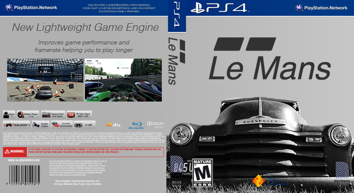
Box Art:
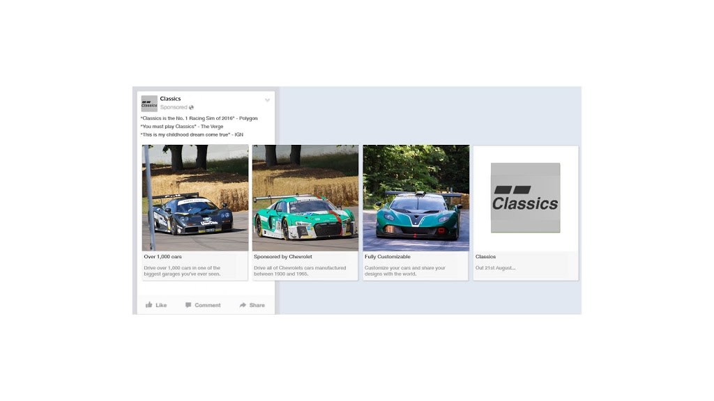
Facebook Advert:

The poster will take a total of 12 working hours to design and produce. These 12 hours account for several conceptual designs, and a final piece. A typical designer would charge £25 per hour. This £25 per hour covers all costs such as insurance, travel expenses, camera loan, tickets for photoshoot event, etc. The total cost is therefore £300.
One website will take a total of 48 working hours to design and code. This includes several rough mock-ups and the finished design. A web-designer would charge around £30 per hour. The total cost is £1440.
The box art will take roughly the same amount of time as the poster, 12 hours, and therefore cost the same – £300.
Advertising space will need to be rented such as bus stops, billboards, and posters inside shops. This will cost roughly £1500 per month. An extra £100 per month will be used for website servers.
The total initial cost is £2040 with £1600 per month after that.
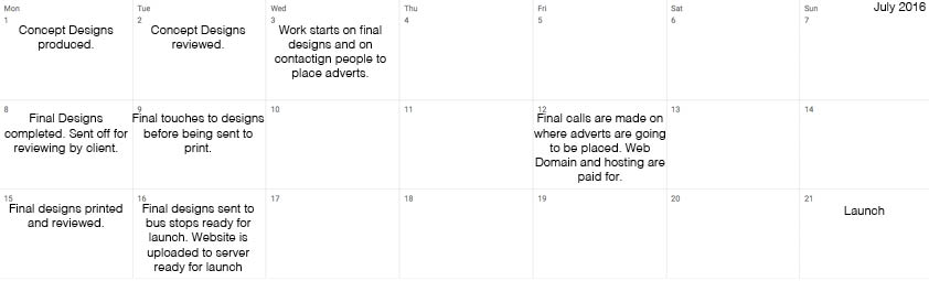
The launch date is exactly one month before the release of the game. This allows enough time for people to see adverts, learn about the game, and pre-order it, ready to play on launch day.
All images have been taken by me, so don’t feature any copyright. There are no people in my photos, so there are no model release forms needed. The image of the bus was not taken by me, however, it just serves as a template for a bus advert. Screenshots have been taken from a similar game which include copyright, however, actual screenshots from the game will be used for the final advertising campaign. I will make sure that the box art has the relevant legal information on it such as PEGI Age Rating, Publisher, and Platform etc. The documents produced will be checked thoroughly multiple times to ensure information accuracy. This game is rated E for everyone, so will display no offensive content.
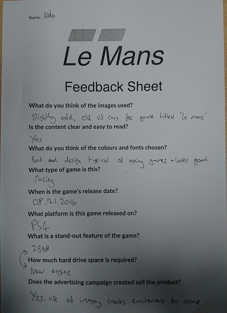

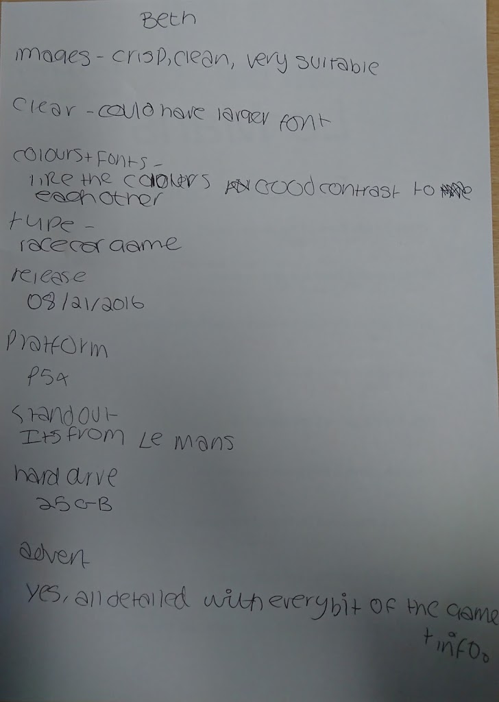

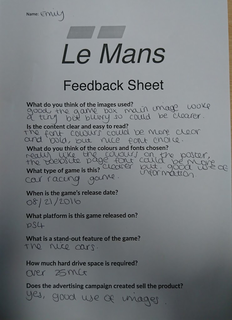
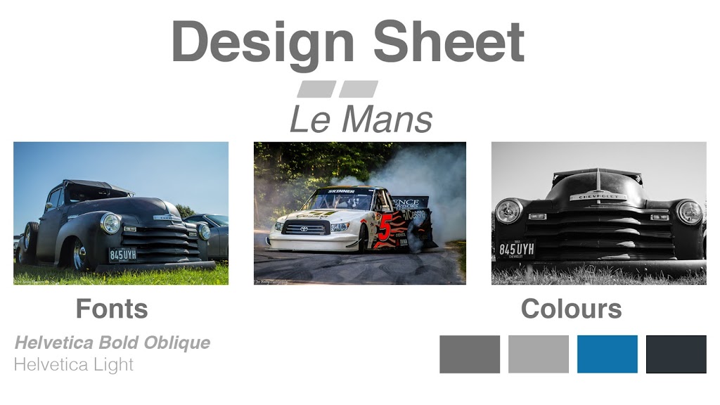
On Friday 1st December I presented my Website, Box Art, and Poster designs for my product Le Mans, to my peer group.
The rationale for my designs is that they use bland colours to attract an older target audience age range between 50-65, as these are classic cars which this age range will enjoy driving. The bland colours don’t detract from the highly saturated colours of the cars. There is a secondary target audience which is 15-25 year olds as this age range are very interested in fast cars, and enjoy pushing them to their limits in competitive online play. Large images are used which fill the poster/screen so as to draw the attention to the fact that this is a racing game. Clear, bold, modern fonts are used because this is a modern game. Cars have often been associated with being posters in boys bedrooms in their teens, and this design ethos has been mimicked for this advertising campaign.
Some of the similar criticisms for my designs include:
The box art was quite low resolution so came out blurry.
Cars used for promotional images don’t match cars typically associated with Le Mans.
Some of the font on the website were too small to read, however, they would appear bigger on a screen, rather than printed out.
Overall, my peers said that they liked the website design the best out of the three designs I presented them.
The target audience for Le Mans is Males aged between 16 and 25. This age range are interested in similar game franchises such as Forza and Gran Turismo. These games are direct competitors to my game.
The purpose of the above two posters is to inform the general public about the game, and ultimately to sell it. They feature the format you can play it on, the tagline which includes information on what the game is about, the name of the game and the game rating. Both posters are large and are in places where many people will see them, which will encourage people to research more about the game.
The target audience for this game is 14 to 20-year-olds. The game is primarily targeted at males of this age because a post-apocalyptic world featuring robot dinosaurs appeals to them as it is something that they would have thought about as a child, and now get the opportunity to play, and live in this world. However, the game also has a secondary target audience of females of the same age. Featuring a strong female lead, this will entice girls to play the game and experience what it would be like if they were themselves out in the wild and having to fend for themselves, creating an empowering feeling. Interests of the target audience will include technology, and video games, as this is what technology could lead to on an extreme level, and it is an interesting concept for people to explore through action and adventure, as well as puzzle solving. Spending power will be quite high as the game and console cost a lot of money as well as further DLC that Guerrilla will release for the game. A high proportion of the target audience’s income will be expendable, meaning that they can buy things such as this game. The target audience’s lifestyle will be relaxed, maybe with the majority of their time at college or work, their free time will be spent gaming meaning they will already be exposed to similar titles.
This game is rated PEGI 16 because it contains “Realistic looking violence towards non-human looking characters – Nonrealistic looking violence towards human characters – Violence causing minor injury only”. However, the game still targets a slightly younger audience because parents will be able to buy this game for their children as their judgement will be slightly different on the violent content, and the child may have already played similar titles featuring violence and have not displayed any change in behaviour because of this.
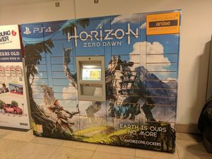
The format of this is a poster, but printed onto vinyl decal and stuck onto an Amazon Locker, which is where people go to collect goods ordered from Amazon rather than having them delivered to their home.
This poster has the PS4 logo in the top left corner in a large font, however, its position means that it isn’t the most important element in the photo. Horizon’s logo is featured in the biggest text in the centre of the poster which attracts the most attention. The font has been chosen to best represent the genre and theme of the game, post-apocalyptic, robot-filled world. There is a large amount of white space around this important text to draw in viewers. Zero Dawn is in a sans-serif font which shows it is very modern, and current, with The Independent claiming it is 2017’s most important game. Earth Is Ours No More is again in a font to resemble the genre and theme of the game, it is positioned in the bottom left corner of the poster, approximately the same size as the PS4 logo, suggesting they have similar importance. It has been centred meaning that No More is directly below Earth Is Ours. Below this the hashtag HorizonLockers is used, allowing users to find out more information on the product, and to tag any photos that they take. In the top right Amazon’s logo is shown in the smallest font. The orange greatly contrasts from the blues used in the Horizon advert. This is featured so that people still know that it is an Amazon Locker. Aloy, the main character of the game, is standing in the bottom left of the photo, about to fight a giant robot dinosaur. This immediately attracts viewers’ attention because it is like something they have ever seen before. The environment also looks very picturesque, which encourages people to buy and play the game. The game’s rating is displayed in the bottom left of the photo which is the smallest of all the content showing that it has to be included, but isn’t there to grasp viewer’s attention, much like the Amazon logo. There is a small margin around the whole of the poster which the text fits in, but the images span the whole front side of the Amazon locker.
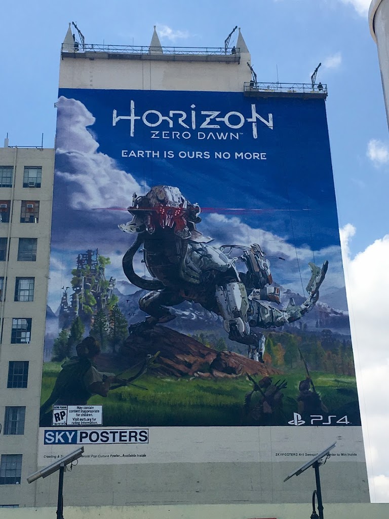
The format of this is a poster which spans the side of a large building. This poster was put up in the run-up to E3, a major games conference in Los Angeles. This poster was released to draw attention to the game and to build up hype before a release date was announced.
The title is in the centre top of the photograph, surrounded by lots of white space, which immediately makes it an eye-catcher. The most important element of this photo is by far the Thunderjaw, the massive robot creature in the centre of the photo. This creature is so massive and so different to anything before that it grasps people’ attention, and makes them want to find out more about the game. The Slogan uses a sans-serif font, which is very modern, which resembles the nature of the game, it is centred underneath the logo. The PS4 logo is in the bottom right of the photo, which shows what format the game will be on, which gives people more idea on whether they will want to purchase this game or at least find out more information on it. There is an age rating for not yet rated in the bottom left of the photo, with an extremely small font with the details of this, which shows that it isn’t an important part of the poster. The colours used are mainly blues and greens creating a peaceful look to the photo, showing a world that you really want to play in. The only red is in the mouth of the Thunderjaw which shows that this creature is hostile and possibly you will have to fight it in the game. An even amount of space has been used either side of the PS4 logo and the age classification, indicating a border around the image. The poster is the full width of the building, however, doesn’t go the full way down, which means it can be viewed from further away as it is a greater height.
a)
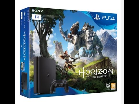
The purpose of this box art is to show off some of the most important features of the game such as Aloy, the main character, and the giant robot standing on the hills. Aloy is about to fight this creature with her bow and arrow, which is what the game is about, so the image indicates this clearly. People who are at the stage of buying the PS4 and game will probably already know lots about the console and game, which is why there isn’t too much information on the front of the box. The age rating and developer’s logo are in the bottom right of the game box, out of the way and small, showing that they aren’t important. The Horizon Zero Dawn logo is the biggest object on the box, apart from the monster, which attracts a lot of attention. Notably, it is more important than the name of the console itself, the PS4, which is situated fairly largely in a blue shape in the upper right hand of the box. The manufacturer’s logo, Sony is displayed in the top left underneath which is the size of the PS4, in a striking white box, which makes it stand out. This has been done to avoid confusion between the two different sizes, and subsequently different prices. An image of the system has been included in the bottom left, overlaying the Horizon Zero Dawn artwork. The PS4 image is fairly large making sure you know the sleek lines of the console that you are buying. There is a disclaimer next to the 1TB text box which is in grey colour on top of a dark background and it is very small making it hard to read. This is because it is not very important to the average person, but has to be included for legal reasons. There is a margin around all four sides of the box for text, which is even and clear, making the text stand out more, as it doesn’t look like it is falling off the box. The images, however, span the entire face of the box.
