

On Friday 1st December I presented my Website, Box Art, and Poster designs for my product Le Mans, to my peer group.
The rationale for my designs is that they use bland colours to attract an older target audience age range between 50-65, as these are classic cars which this age range will enjoy driving. The bland colours don’t detract from the highly saturated colours of the cars. There is a secondary target audience which is 15-25 year olds as this age range are very interested in fast cars, and enjoy pushing them to their limits in competitive online play. Large images are used which fill the poster/screen so as to draw the attention to the fact that this is a racing game. Clear, bold, modern fonts are used because this is a modern game. Cars have often been associated with being posters in boys bedrooms in their teens, and this design ethos has been mimicked for this advertising campaign.
Some of the similar criticisms for my designs include:
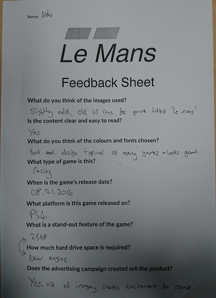
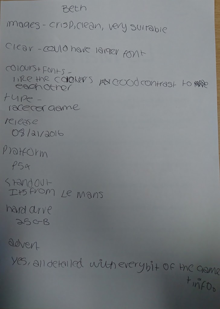
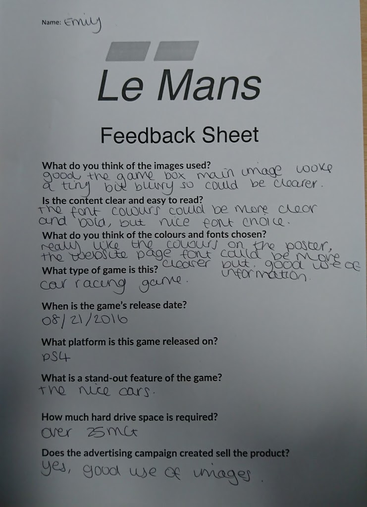
The box art was quite low resolution so came out blurry.
Cars used for promotional images don’t match cars typically associated with Le Mans.
Some of the font on the website were too small to read, however, they would appear bigger on a screen, rather than printed out.
Overall, my peers said that they liked the website design the best out of the three designs I presented them.
