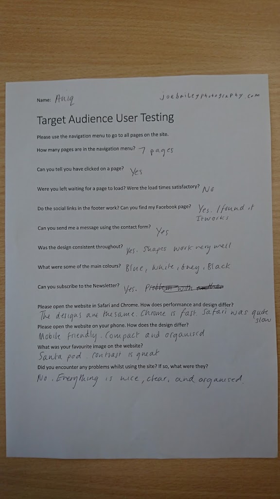
Target Audience User Testing
Please use the navigation menu to go to all pages on the site.
How many pages are in the navigation menu?
Can you tell you have clicked on a page?
Were you left waiting for a page to load? Were the load times satisfactory?
Do the social links in the footer work? Can you find my Facebook page?
Can you send me a message using the contact form?
Was the design consistent throughout?
What were some of the main colours?
Can you subscribe to the Newsletter?
Please open the website in Safari and Chrome. How do performance and design differ?
Please open the website on your phone. How does the design differ?
What was your favourite image on the website?
Did you encounter any problems whilst using the site? If so, what were they?
Successful notification of contact form enquiries:

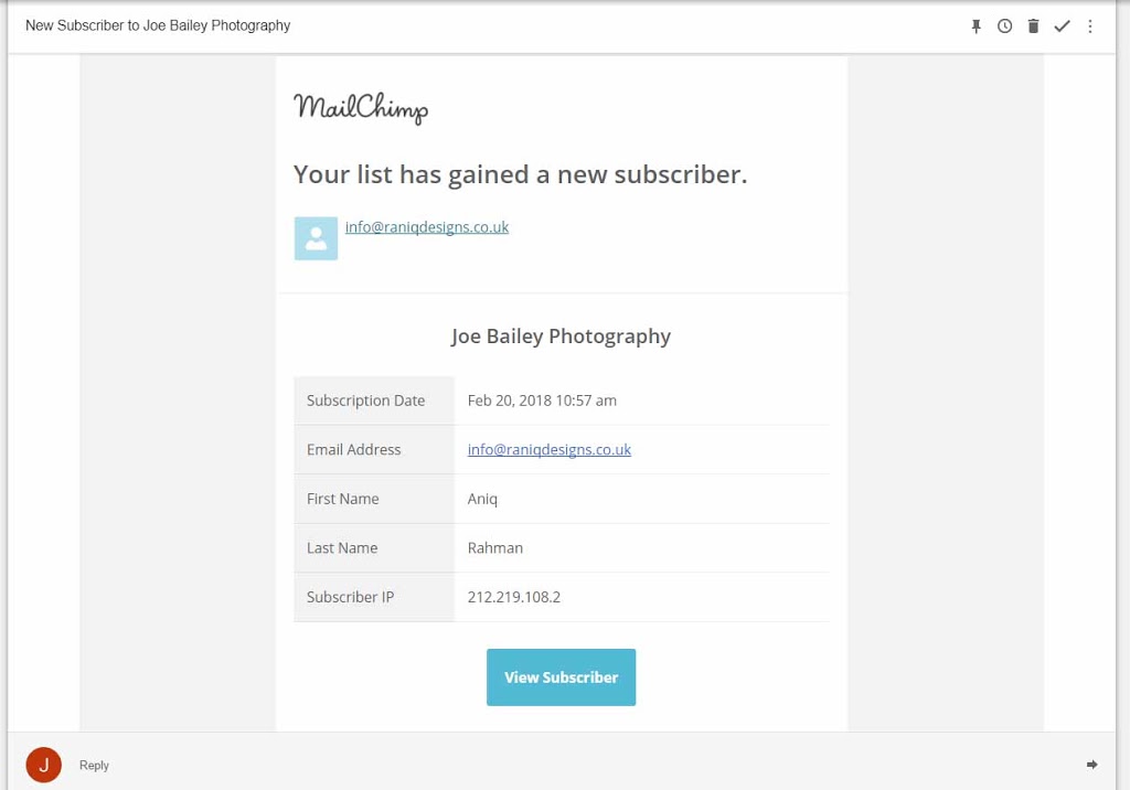
Successful notification of subscription to newsletter:
Target Audience User Testing Completed Forms:

Above: The Instagram widget was broken because school wifi blocked the domain where the widget was hosted. This is a school only issue, so I won’t bother to rectify it.
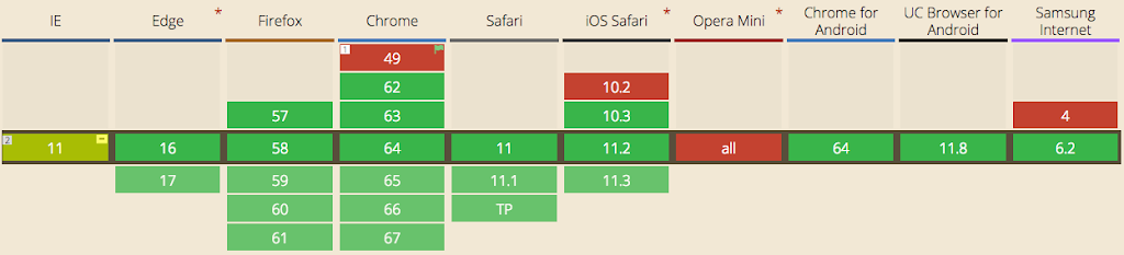
Text overlap issues were caused by having outdated browsers on school computers. They did not support CSS-Grid which is a relatively new specification. Most browsers will automatically update themselves and all modern browsers now support the feature, so I won’t bother to change the website for this issue.
The graph below shows support for CSS-Grid:

Above: School antivirus blocked this student from opening Safari for some reason, nothing to do with the website.

The full-size images used as the header of the page make it difficult to tell when you have changed page.
Improvements to be made:
- The website is reported to be very fast from all of my test audience.
- After receiving feedback from my Target Audience I have found that website performance suffers when using safari. I will have to test the website again on this browser to see if I can determine the problem.
- All users liked the design and thought it was professional and neat.
- Only one person identified the purple colour when clicking on a link. This was very faint, so will need adjusting so more users can see it.
- When searching for Joe Bailey Photography on Google, my website is the second result. I will try to improve my result by using an SEO Checker to improve my websites score and to provide insight into how to do so. One way would be to lengthen page descriptions, as they are quite short at the moment.
- There are a lot of different colours on the homepage which may cause some confusion as to what colours are in the main theme of the website. More thorough user testing and changes to where different colours are displayed on the website would help rectify this problem.
- A comment was given on how the use of shapes and slants on photos was very unique and worked well. This is something I will try to do more of on subsequent pages added to the site.
- One user encountered a small error using the newsletter sign-up form. Newsletters are handled through a third party (Mailchimp) which leaves little control of sign-up pages. In the future, I could migrate the newsletters to in-house so that I have complete control.
